Replica Watches
Although Good quality Two hundred and fifteen clicks unseen at night limits of the windowless circumstance, Patek Philippe has given it the actual good finishing and replica watches ornamental thrives for this greatest Geneva the watchmaking industry: Geneva ocean, beveled and refined sides, refined screw brains, satin-finished indication wheel and also ratchet wheel, slick flanks around the gears’ tooth, plus a Gyromax equilibrium.This demonstrates refined bevelled aspects, Geneva beating and richardmille.to spherical graining around the primary denture.

Top 10 Boutique Hotel Brand Designs

These boutique hotels use brand design to elevate their guest experience and drive bookings.

We’re talking about logos, graphic design, and visual brand systems! The mark. When asked about “Best Hotel Design”, interior design and architecture take the headlines understandably because a hotel “brand” is the totality of experience. But the bow of the ship plowing the waters of differentiation in the minds of guests is…a visual identity driven by a powerful narrative. A compelling hospitality concept symbolized by a beautiful brand identity unites architecture and interior design in a seamless holistic experience across the guest journey. These hotels are brand driven and use it to their advantage!

How did we choose the best visual identities?

  1. The brand identity design is evocative & fresh
  2. A fluid visual system (not just a logo but a graphical brand world expresses the brand)
  3. The brand design is rooted in a narrative concept that speaks to the soul as well as the eye.

1) La Fantaisie
La-Fantaisie

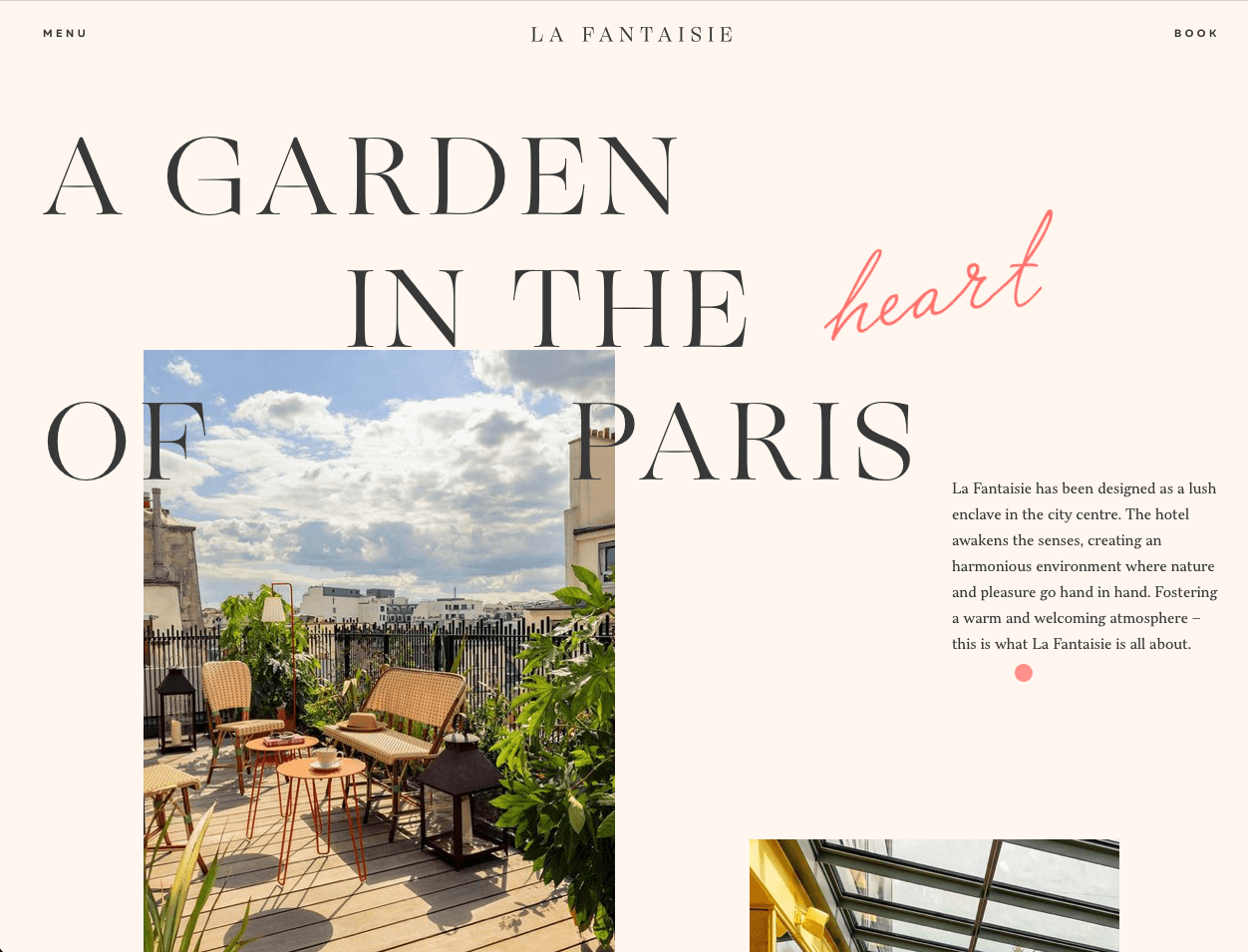
Paris, city of lights and hidden treasures. La Fantaisie makes it easy to imagine stumbling upon your own private garden oasis in the heart of Paris. From concept to articulation, this branding is delightful and discoverable as the layers of the identity reveal themselves in the digital and property experience.

Location: Paris
Design: PETITDIDIERPRIOUX (Architect), MBDS (interior design)
Visit website

2) Chateau Grande Hotel
Chateau_Hotel_Logo_B

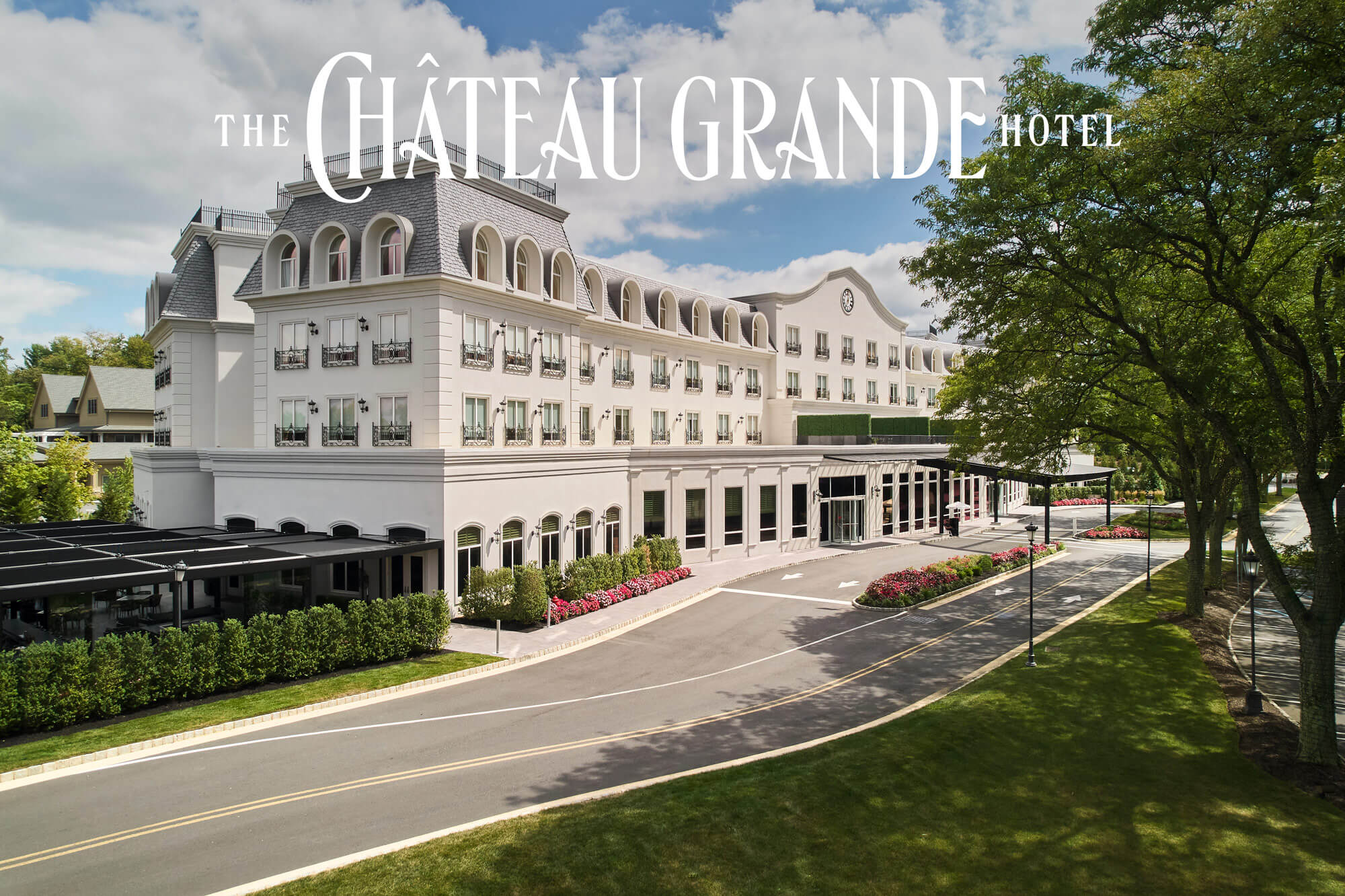
“A visit will brighten your day, a night will change your life.” Chateau Grande Hotel is a place where we enter one way and leave changed—no hyperbole as the chateau is a dynamic wedding and business confab destination just south of New York City. The custom typography is the structural system for the brand as enlarged letter forms become abstract symbols for movement and transformation.

Location: East Brunswick, NJ
Design: Satellite Agency
Visit website

3) Santa Mauro
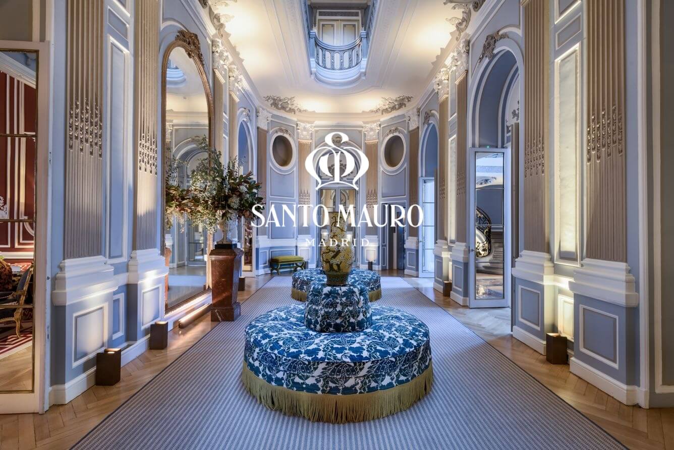
Santa-Mauro

This European luxury hotel breaks down the title barrier. “The new breed of aristocrat isn’t defined by blood, but by spirit.” Democratizing access resonates even in the lap of old-world refinement. We love the lean serif typography paired with maximal riotous interiors.

Location: Luxury Collection, Madrid, ES
Design: NoHo Communications
Visit website

4) Café Royal
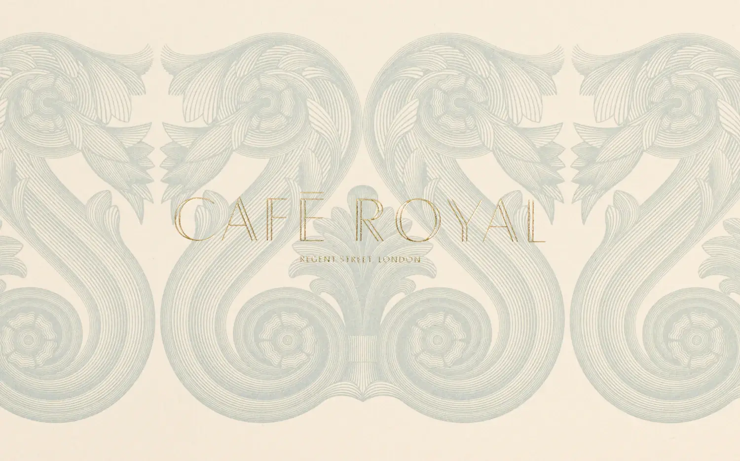
Café Royal

Grandeur and minimalism collide, engage, resolve in this David Chipperfield architected property. The modernist precision of the classic architectural features combine deliciously with the timeless identity typography. Historically and avant- garde meeting place the tight, restrained interiors of Café Royal invigorate through juxtaposition.

Location: London, UK
Design: Pentagram (branding), David Chipperfield (architecture)
Visit website

5) Villa Beluno
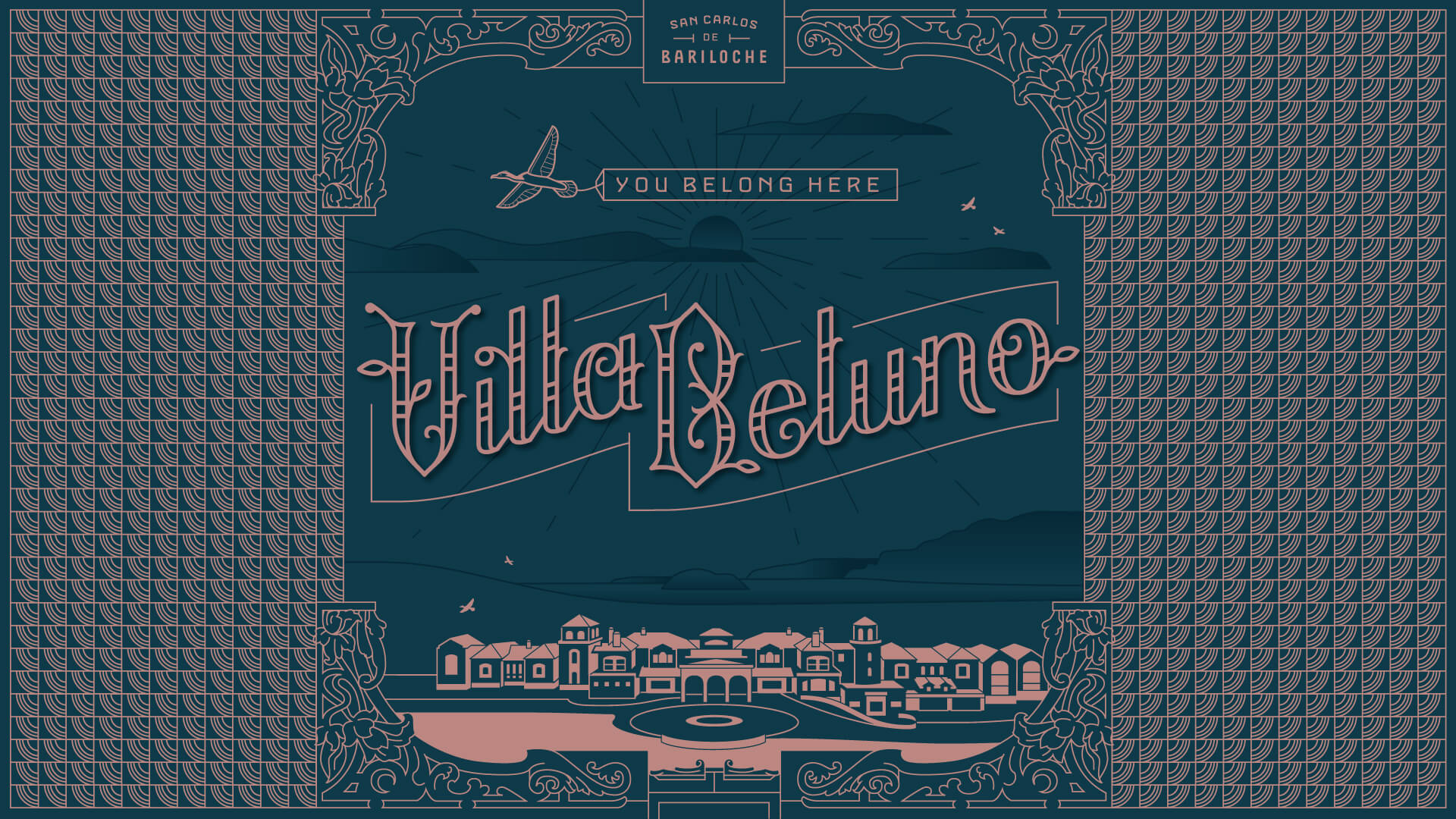
Satellite_VillaBeluno_HeroImg

Perched on the Nahuel Huapi Lake in Bariloche, Argentina, Villa Beluno exists on plane somewhere between the blunt physical world and the delicate memories made under the breathless firmament of Patagonian skies. This brand system is gorgeous in capturing the brand ethos and evolving delightfully across the guest journey, reminding us that “we don’t come to Villa Beluno to forget, we come to remember.”

Location: Bariloche, AG
Design: Satellite Agency
Visit website

6) The Hermitage Hotel
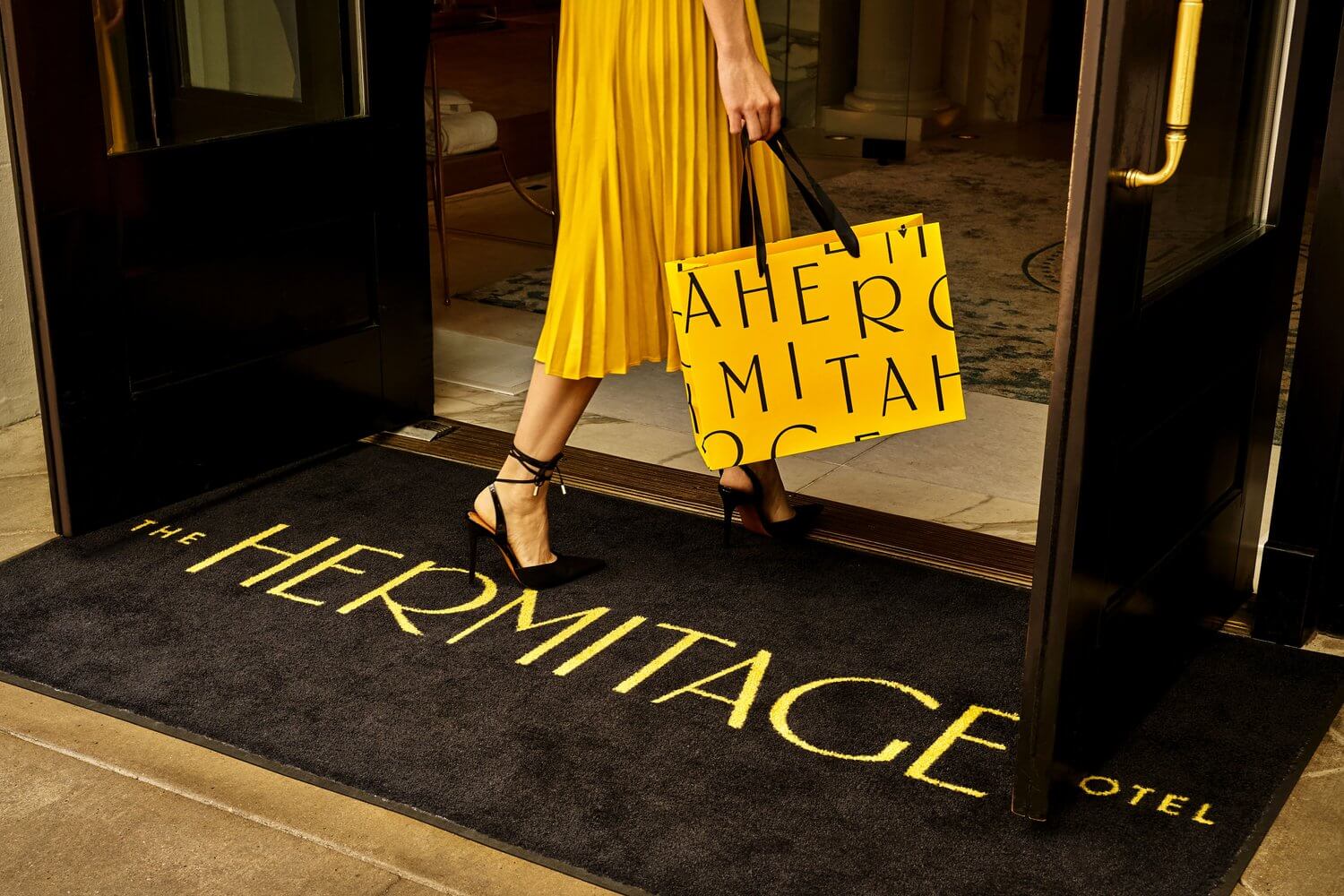
Hermitage-H-FrontDoor2

The Hermitage, renowned as Nashville’s “first million dollar hotel” when founded in 1910, dazzles with a rebrand by Mucca. This “hermitage” is any but. Situated front and center in the energetic Nashville art district, The Hermitage is a bold reclamation of a new southern hospitality—one taking its inspiration from Suffragette supporters who famously organized out of the hotel sporting yellow roses of camaraderie. The historic typeface gets a modern update inspired by the hotel’s Beaux Arts interiors.

Location: Nashville, TN
Design: Mucca
Visit website

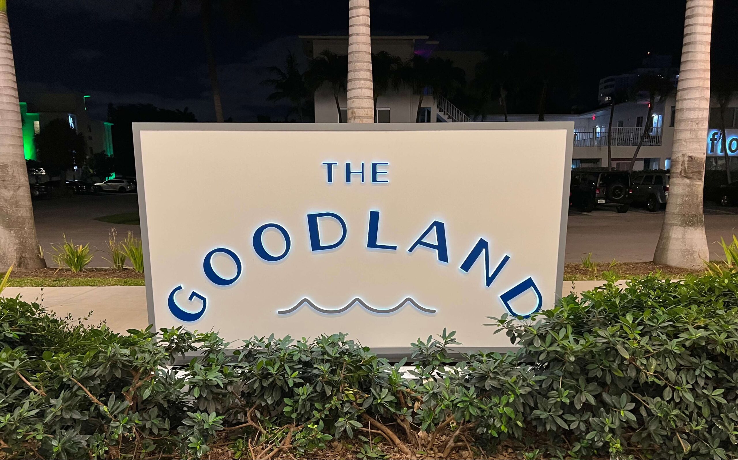
7) The Goodland
Goodland

Working with the properties mid-century modern architecture, the Goodland brand by Kimpton resonates with accessibility, beach and casual adventure vibes. The oval-esque type and iconic water symbology don’t pander but invite guests to enter into the relaxed world of Goodland.

Location: Ft. Lauderdale, FL
Design: Kimpton
Visit website

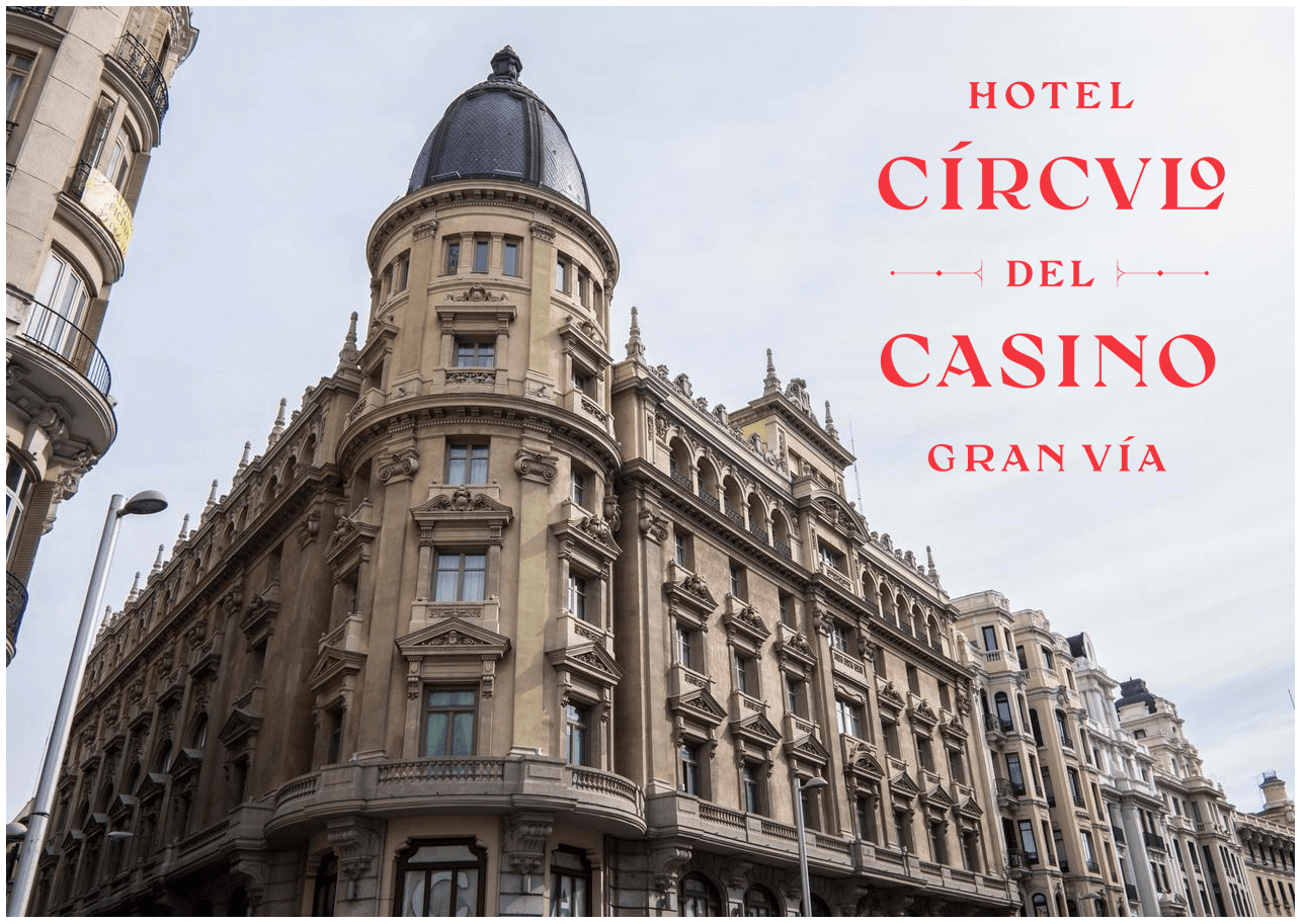
8) Hotel Circulo Gran Via
Hotel Circulo Gran Via

Inspired by the property’s casino heritage and neoclassical architecture, Creative Director, Kevin Cantrell, created a comprehensive hotel branding system with bold, pattern geometries inspired by the casino. Infuse the opulence of gold foil intertwining with hand crafted typography and this casino hotel is grand parlay worth the bet.

Location: Madrid, ES
Design: NoHo Communication, Kevin Cantrell, Miguel Cano Graff
Visit website

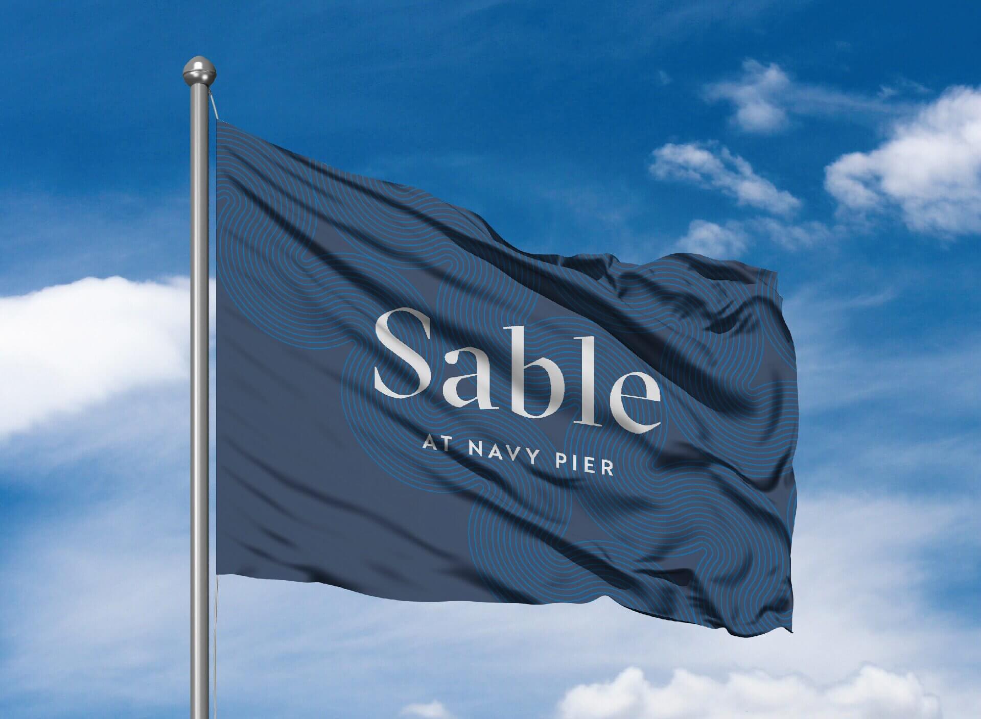
9) The Sable
The-Sable

This Hilton Curio Collection is fast becoming an icon property in the heart of Chicago’s Navy Pier. Pulling their concept from the hotel’s namesake—the aircraft carrier Sable that was once docked here—the Sable is a place for new take-offs and landings. A sophisticated nautical theme pervades asking: to where your next voyage?

Location: Chicago, IL
Design: The Getty’s Group
Visit website

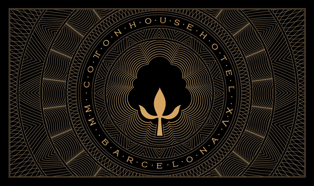
10) Cottonhouse Hotel
Cottonhouse Hotel

The Cottonhouse is the crown jewel of the Marriott Autograph Collection. Situated in an historic cotton ginny reborn as luxe base-camp for exploring Barcelona, The Cottonhouse reimagines threads as opulent guilloche patterns gilding your cosmopolitan experience. The identity system is expertly adapted across the website, interior design, personalized products, wayfinding and hotel communications. The Cottonhouse branding weaves past and present beautifully.

Location: Autograph Collection, Barcelona, ES
Design: NoHo Communication, Kevin Cantrell, Miguel Cano Graff
Visit website

Did we get it right? Who do you believe has incredible hotel identity design?

Stock Bottle vs. Custom Spirit Bottle Design

Cutting through the clutter at retail has never been tougher, a branded custom bottle may be your answer.

You’ve created your dream distilled spirit. You started a company, sweated over the recipe, tested and blended, raised financing and now you’ve got to get that ‘juice’ packaged for sale! And craft spirits are booming. In 2005, there were 100 craft distillers according to Forbes. By 2018, over 1800. The total U.S. spirits market, measured at $44 billion, is expected to grow 6% per year through 2022. All this promises ample opportunity for distillers, but also a tough fight for recognition, bar and shelf space.

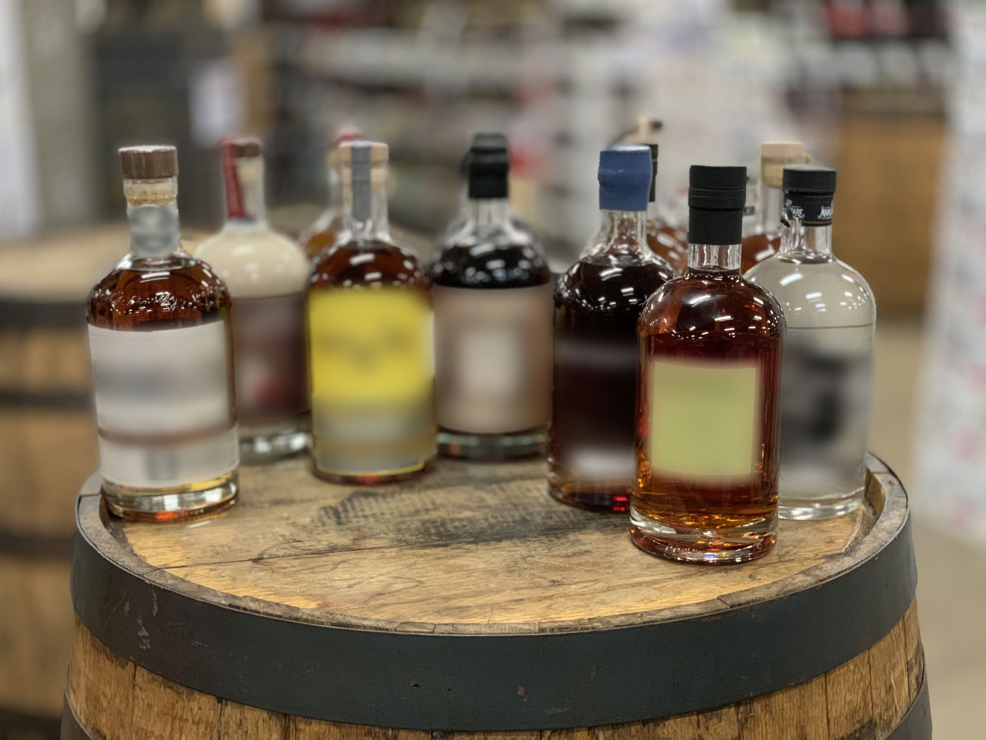
The savvy distiller knows that a good product can be wrecked by poor presentation, but also understands that a great product is the sum of distilling prowess and knock-out packaging. Certainly a compelling brand story and labelling plays a role in differentiation, but how does your choice of bottle create immediate separation from—or in many cases, homogeneity with—the competition!? For most, a stock bottle is the reflexive choice. For the brave (and let’s face it, the capitalized) a custom glass design can make your brand’s bold claims without words at all—here I stand, an original and proud—drink me!

So why choose a custom bottle?

  1. Attract todays experience seeking customers
  2. Disrupt on crowded shelves
  3. Accelerate your business

First, how do you create something with distinct customer appeal? Customers are either seeking the shelter of a known spirit, OR, desire to experience something fresh and expressive. Strategy&, PwC’s strategy consulting group, discusses how millennials and GenZ seek out brands that are “’sustainable, experiential, personalized’—this is their cool”. And packaging company TricorBraun notes, this means diminished interest in the “old world brands that were revered by their parents”. These experience seekers are open to captivating brand stories and the originality behind them that sparks a personal connection. The act of discovering and sharing a spirit brand that presents itself honestly is a demand driver. Sadly, many spirits share the exact same bottle.

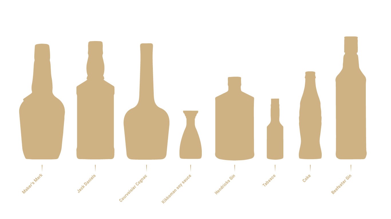
They’re spilling brand equity on the bar room floor. One of the strongest advantages of a custom bottle lies in the silhouette—the outline shape—of your bottle. Without seeing any brand marks, we can all recognize these:

Certainly, it takes time and investment for those shapes to become associated with specific brands but their visual power is undeniable. You don’t get that from stock.

The complete package of labels and custom glass that communicates your brand story becomes a competitive advantage: there will be nothing like YOU on the market. And, now you have the potential to become an icon.

Second, let’s acknowledge a hard truth: the shelves are overcrowded and space at a premium. How do you win the look-my-way-&-pick-me-up battle? With thousands of established and challenger spirits out there, the best way to cut through is through a well-honed story backed by a killer visual brand language—aka a custom bottle—that amplifies it. There are various strategies for achieving this: from minimal to opulent, heritage to modern, and more. This is a highly creative exercise focused on drilling down to the essence of your brand and products, and distilling that into a compelling Beautiful Truth that’s at once authentic and visually poetic. Great design obsesses over the physical details of the bottle. How does it feel in the hand? Bottles are not flat webpages, but tangible objects embodying a brand’s aspirations. It’s time to sweat those details: embossed textures of quality seals or taglines, a balanced weight, handle-ability (i.e. is there enough neck for the bartender to hold?), is the width so wide that they turn it sideways hiding the product!? Everyone wants a solid bottle but if it’s too heavy you’re wasting material and impacting hold-ability; too light and the product feels cheap. In other words, there’s a balance between the functionality of the design and aesthetics that champion your brand. The power of a well-conceived, dimensional design wins the consumer I-like-the-feel-of-you test.

Third, for a distiller nothing says “we’re legit” like your own bottle. It shows confidence in your brand, in your product and in your longevity. In many ways it’s a rite of passage for adolescent beverages that have shown promise and are now blossoming into maturity. This commitment to the product is not lost on customers, distributors and investors. Kirsten McGannon, Head of Marketing for Tom’s Town Distilling in Kansas City, described graduating to a custom bottle for their spirit line up as “game changing. The world suddenly took us very seriously. Calls from distributors and customers from outside our territory suddenly came out of the woodwork.”

Who is doing it well?

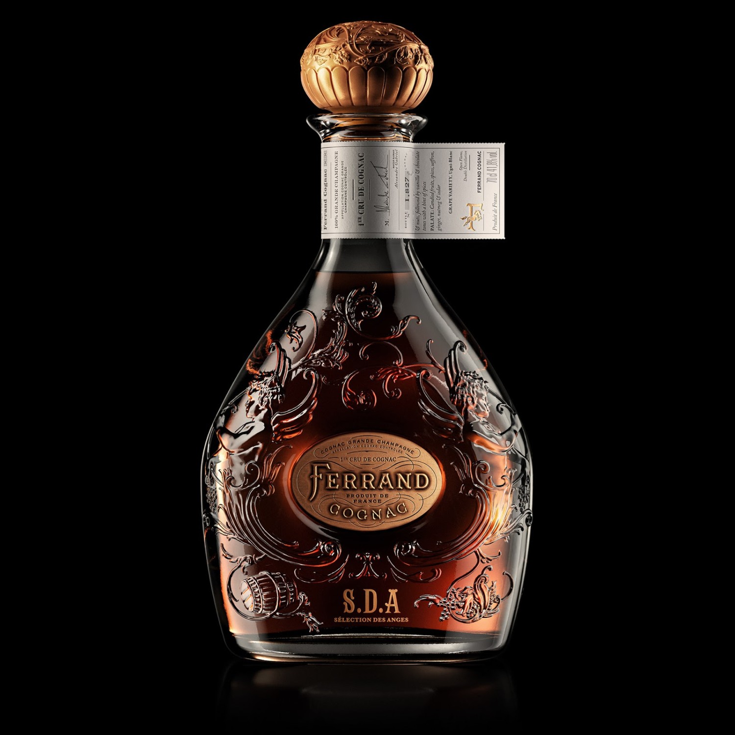
Maison Ferrand’s flagship 100% Grande Champagne Cognac has roots in the region stretching back over four centuries and ten generations. Founded by Alexandre Gabriel in 1989, the brand stands for traditional, premium, artisanal French cognac. Their custom bottle supports this narrative in several ways: Ferrand updates the classic, tear-drop, long-necked brandy bottle silhouette with a shortened neck for a more heritage look. The glass embossed filigree communicates French opulence while the metallic escutcheon connotes hand craftsmanship. The stopper choice is the coop de gras, with its royal scepter aesthetics convincing us all of Ferrand’s guardianship of the traditional cognac production techniques.

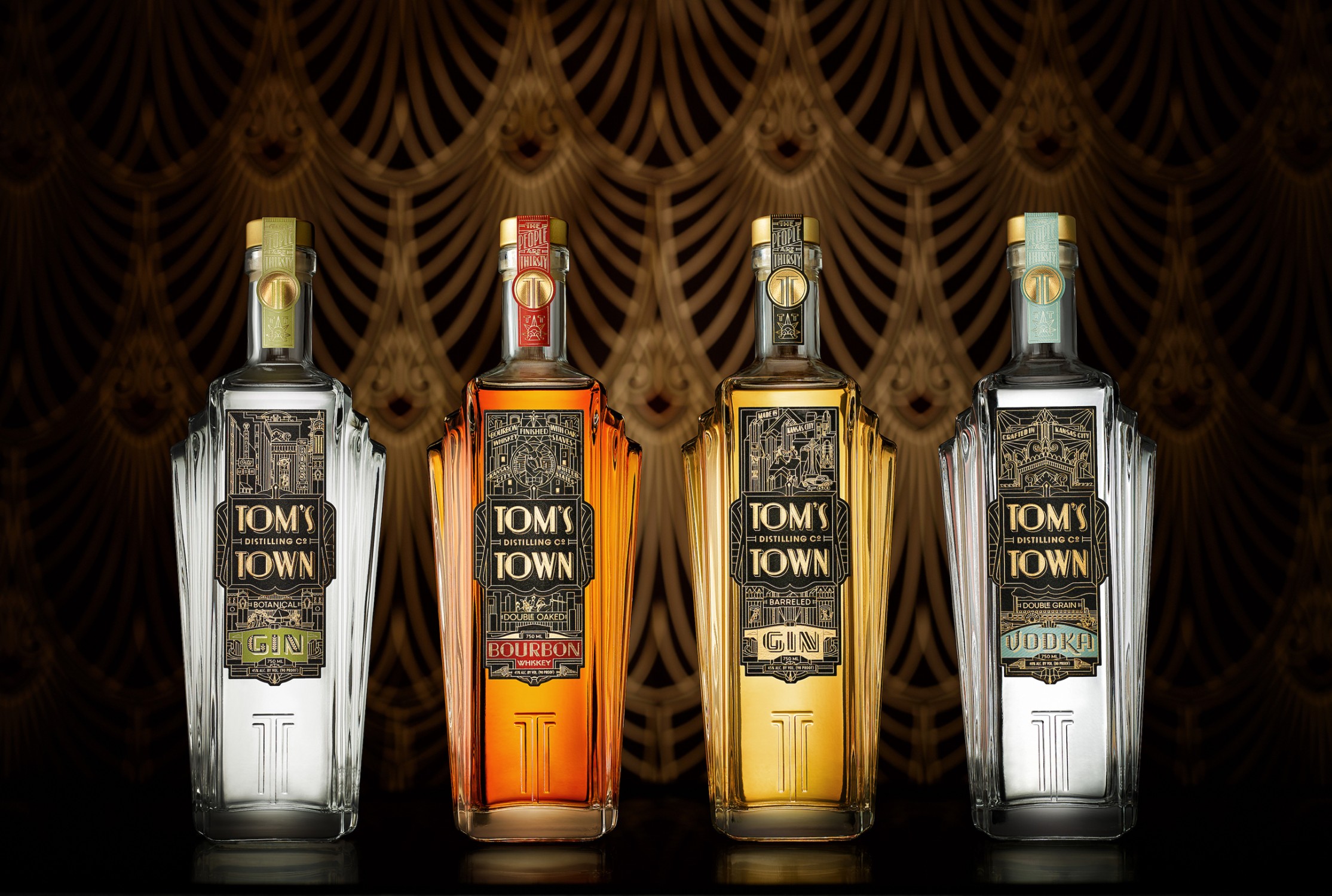
Tapping into the rich prohibition era history of Kansas City notorious for flouting prohibition through the advancement of elicit good times, Tom’s Town Distillery proudly proclaims: “The People Are Thirsty”. The distillery produces craft gin, vodka, and bourbon spirits for the masses. Deco themes of bustling urban good-times, freedom, jazz and prosperity come to life through their custom bottle. Designed by the Kevin Cantrell Studio, Kansas City’s deco architecture informs this iconic silhouette where the bottle rises from the bar like a skyscraper reaching toward the heavens. Symmetrical balustrades suggest power and anchor the bottle visually. Embossing adds tactile joy bringing the modern TT monogram and the brand’s tagline to life. A slightly elongated, yet diminutive neck aids balance and pour-ability. The brand strategy was to build high recognizability and equity for Tom’s Town around a singular bottle platform with spirit type communicated through label differentiation.

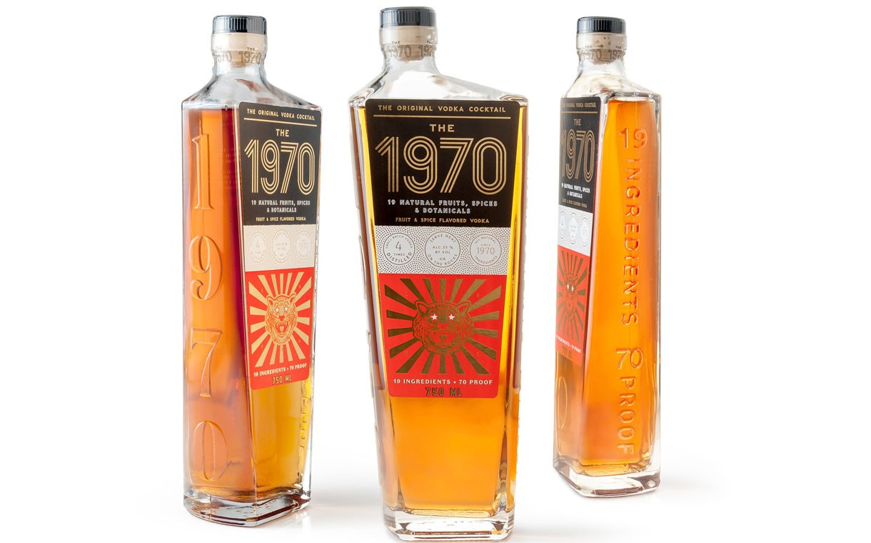
Launching a specialty product like The 1970 liqueur which sits outside of the canonic whiskey, gin, vodka trinity is a particular challenge. The 1970 does this in a curiously exuberant and authentic way. This is a highly personal, intercontinental brand story: The 1970 was first created in Miyazaki, Japan by founder Ikeda Feingold’s grandmother. In the summer of 1970, she mixed a cocktail using the fruits, botanicals and spices from her garden. For the last forty years, the Feingold family has served The 1970 in over three continents to family and friends. In 2017, Ikeda launched The 1970 for all to enjoy. These idiosyncratic themes form an unexpected but authentic origin story: the bon vivant life style of the 70s era, the radial sun image reflecting Japan, and the asymmetrical and cinemagraphic bottle shape suggest living life outside the confines of the ordinary—just like this spirit style itself.

Finally, it’s important to underscore that a bottle design need not be flamboyant or outrageous to be effective. Bulleit Bourbon and Few from Chicago make great use of custom bottle designs that put forth distinctive silhouettes and shapes while maintaining a reserved, tasteful character. Pushing too far for the sake of standing out will be identified as gimmicky and may suggest the brand is trying too hard to compensate for a sub par product. As always, authenticity and a great story will beat flash all day.

Is your company a good candidate for custom bottle design?

While a solid bottle design will advantage the brands who embrace it, it’s still not for everyone. Embarking upon a branded custom bottle design is best for:

  • Well capitalized startups
  • Distilleries with a proven product, demand and production capacity
  • Brand managers at spirit conglomerates seeking to launch a disruptive spirit brand, or refresh a current line

A well-financed startup with management know-how and industry experience can make a big splash with a new product in a custom bottle. That extra touch of brand thoughtfulness and professionalism can accelerate growth by quickly gaining the attention of buyers, distributors and investors right out of the gate.

As a Brand Manager at one of the big liquor houses such as Diageo, AB InBev, Beam Suntory, MillerCoors, and others you are constantly challenged to deliver brand growth. That means refreshing the old, or being tasked with disrupting the new. New product categories abound, e.g. hard seltzers, alcoholic kombucha, CBD and cannabis beverages. Or new customer segments opportunities emerge—e.g. introducing millennials to bourbon. Custom bottle designs that align to authentic brand stories improve your odds of success.

So you’re ready to go with a custom bottle, what are the next steps?

At a high level, here’s the workflow for producing your custom bottle:

  • Clarify your brand. Lock in positioning, story, differentiators –i.e. nail your brand & product strategy!
  • Business case development. Investment budget, case sales to breakeven.
  • Bottle Design (concept & finalization based on strategy)
  • Identify production vendors
  • Submit RFP & compare quotes apples to apples
  • Prototyping, testing, finalization
  • Mold development
  • Production

Good design isn’t a matter of being solely struck by the lightening of inspiration. It’s based in solid brand strategy. Triangulating the white space between market opportunity, competitors, and your unique strengths lead to an authentic positioning that we call the Beautiful Truth of your brand. From this narrative foundation, good bottle and label design emerge. As noted in the examples above, the shapes and textures of the glass themselves bring focus to the brand’s story. Other strategic and economic issues also come to play: are you creating a singular bottle design to feature a halo-providing flagship spirit; or, a work horse bottle design that while still distinct, works across your product line up? The answers to these questions impact design and investment.

Navigating the process can be tricky. Some hire specialist spirit branding agencies such as the Kevin Cantrell Studio or Satellite Office, or hire consultants with bottle manufacturing expertise such as Thoroughbred to shepherd themselves through the process.