Tom’s Town Design
Tom's Town
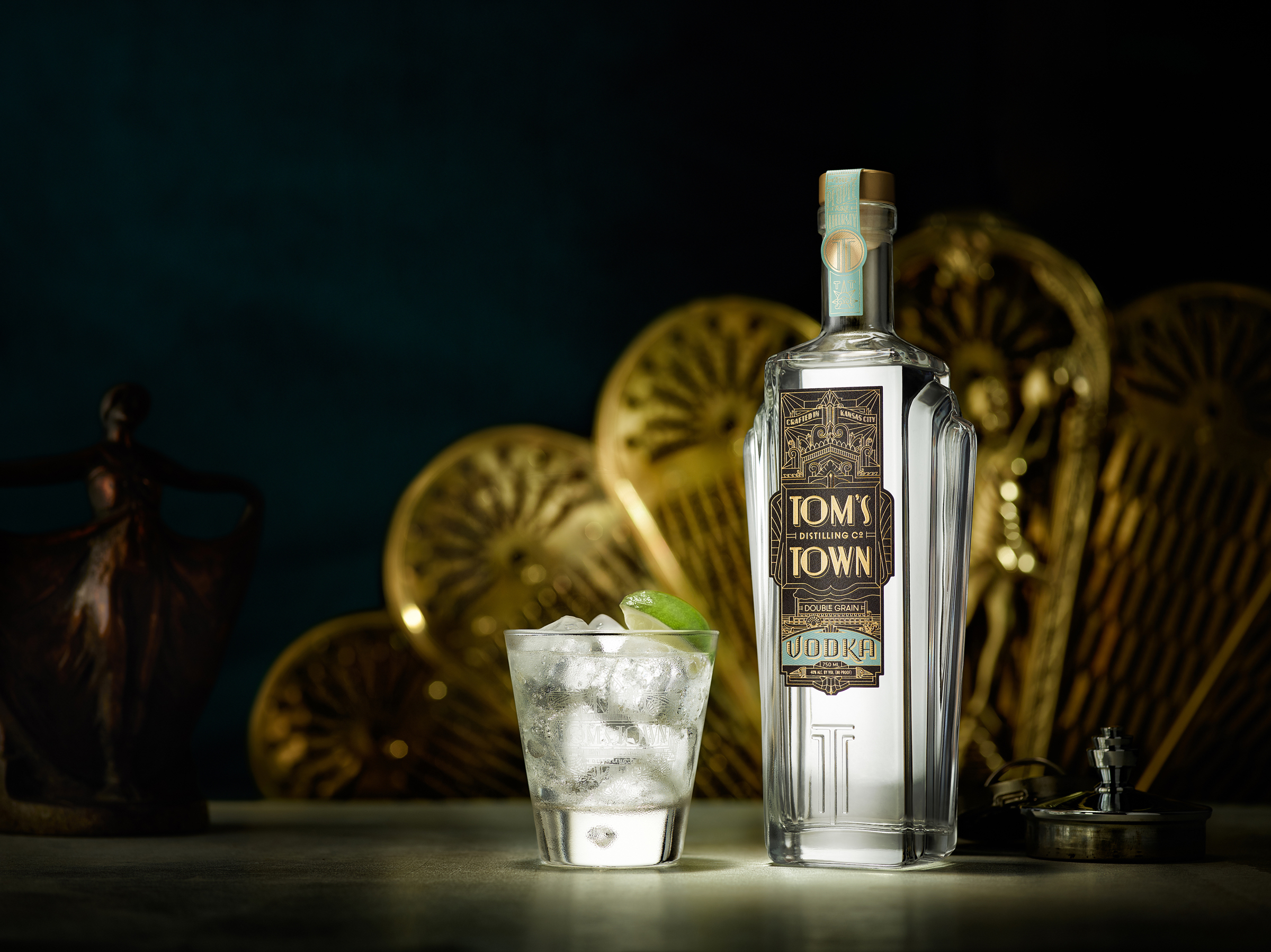
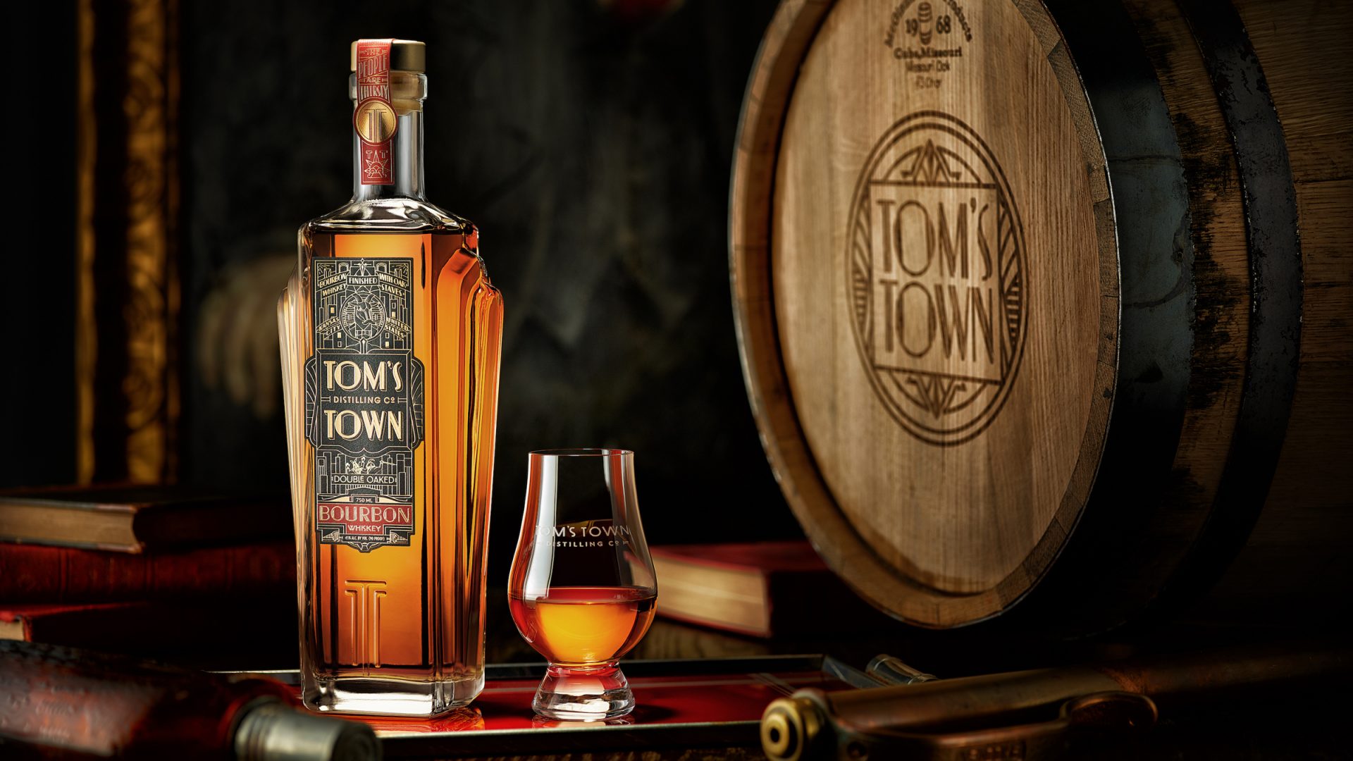
Custom Bottle Design Embraces Kansas City Deco
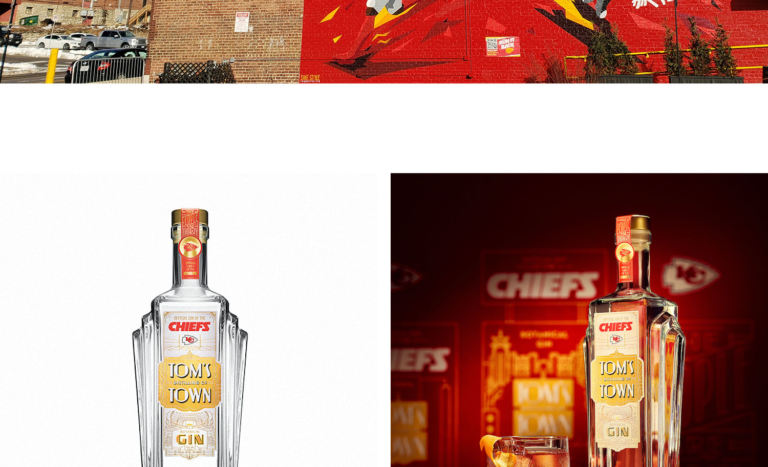
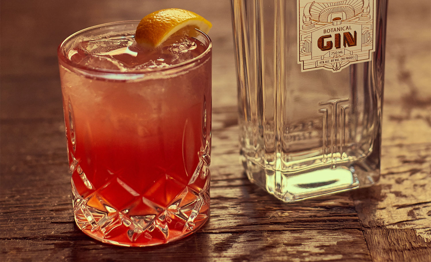
After developing the brand strategy and visual identity system for the Kansas City distillery, Satellite and the Kevin Cantrell Studio got to work extending the brand into a custom glass bottle design that reflected the distillery’s Roaring Twenties roots.
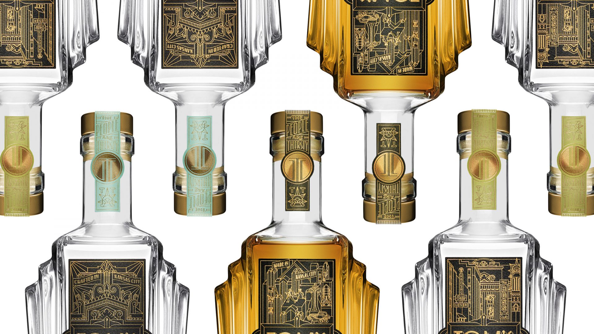
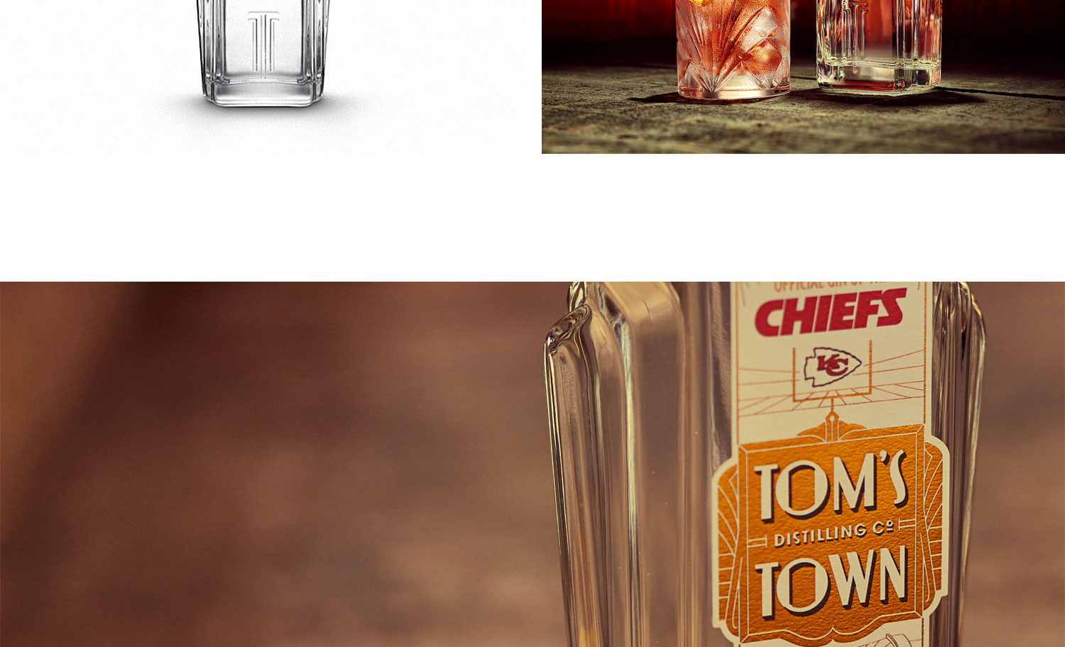
Towering Balustrades
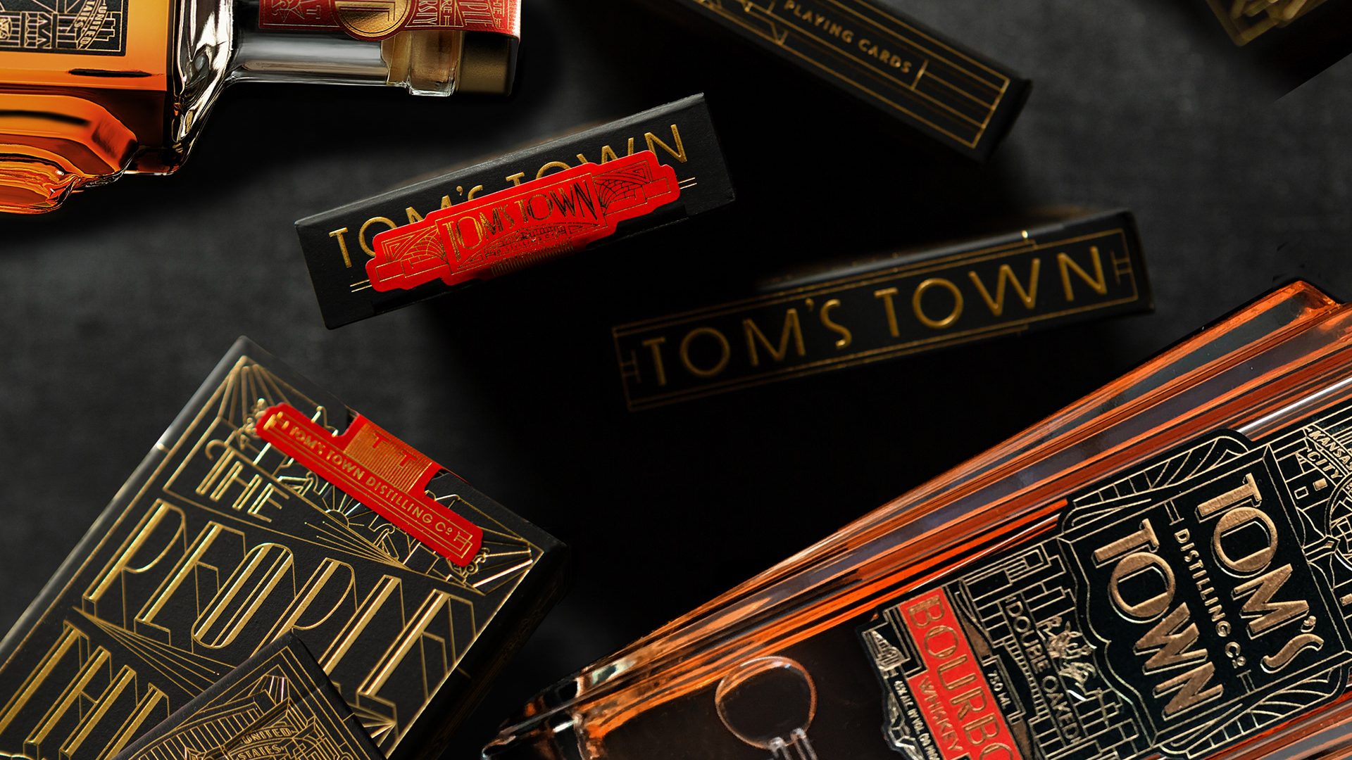
festoon the bottle grew from the dramatic geometry of Kansas City’s Art Deco architecture. And the iconic, embossed Tom’s Town’s double “TT” monogram with companion manifesto, “The People Are Thirsty”, further help the brand stand tall on the shelf next to common stock bottles.
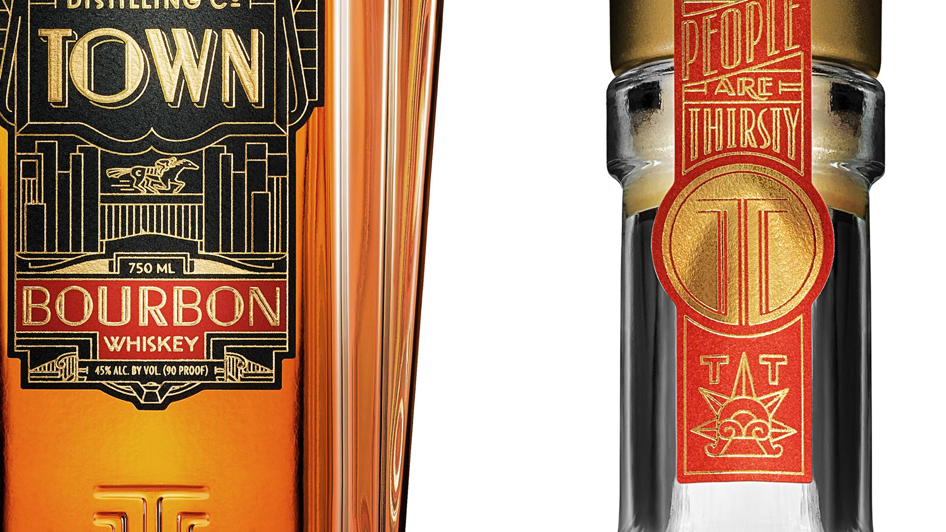

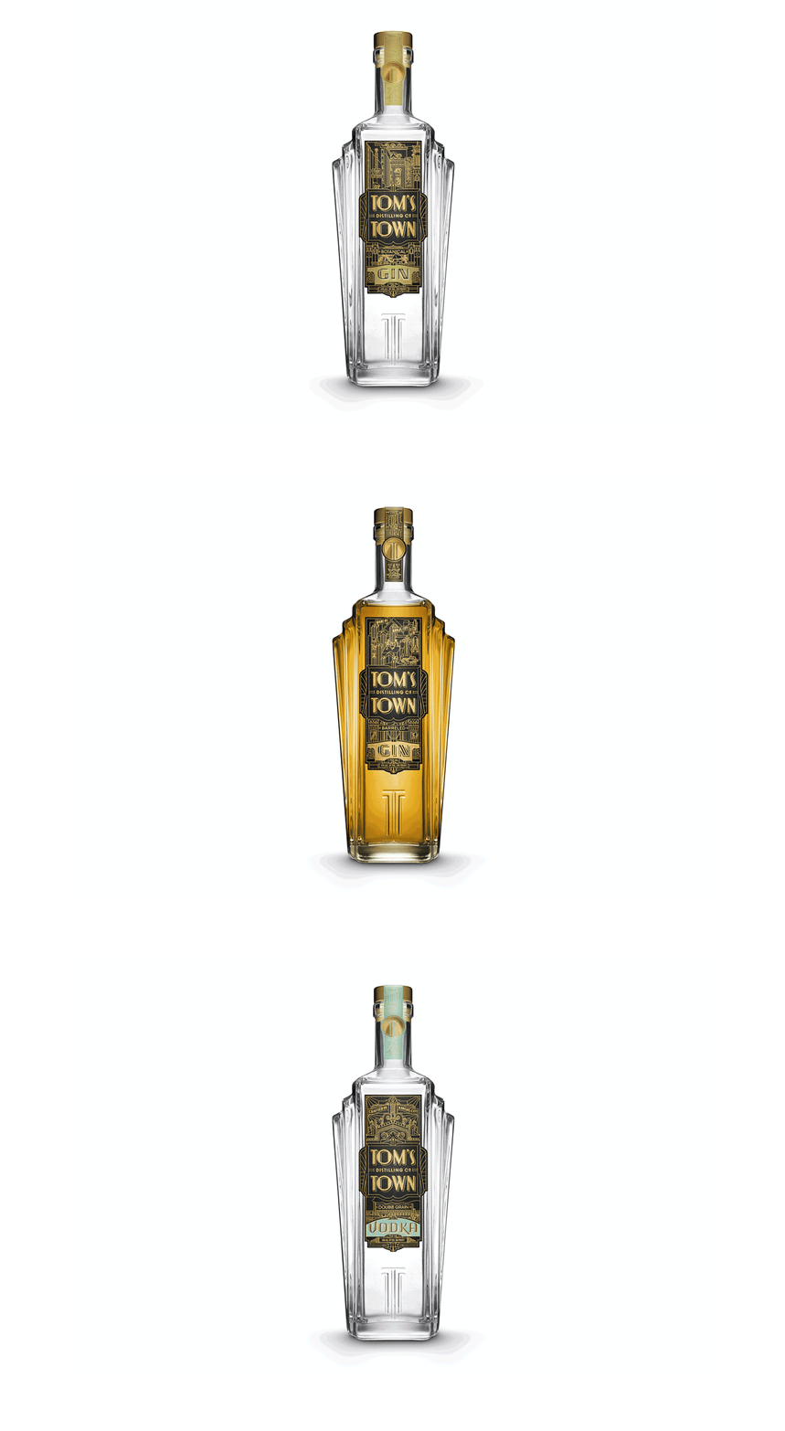
The Custom Bottle
evokes the grandeur and magnificence of prohibition era Kansas City,
known by all in the know as the “Paris of Planes”, and a “City of Fountains”
where spirits ran free.
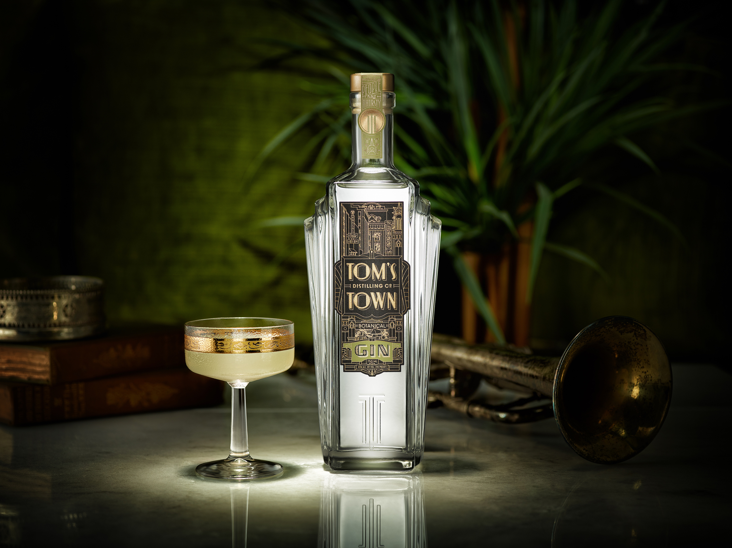
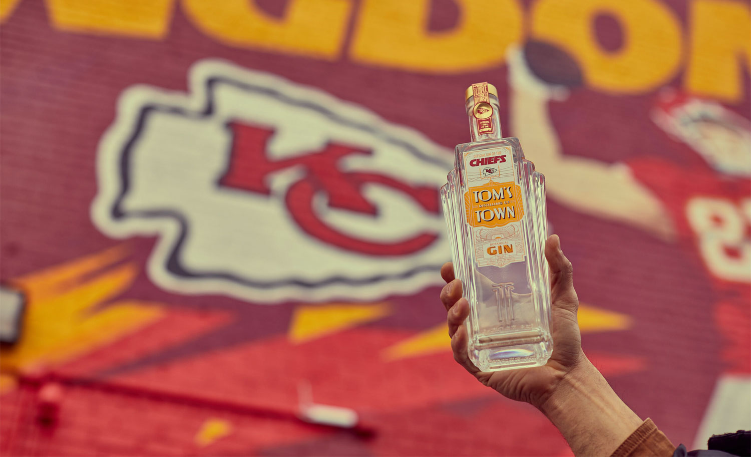
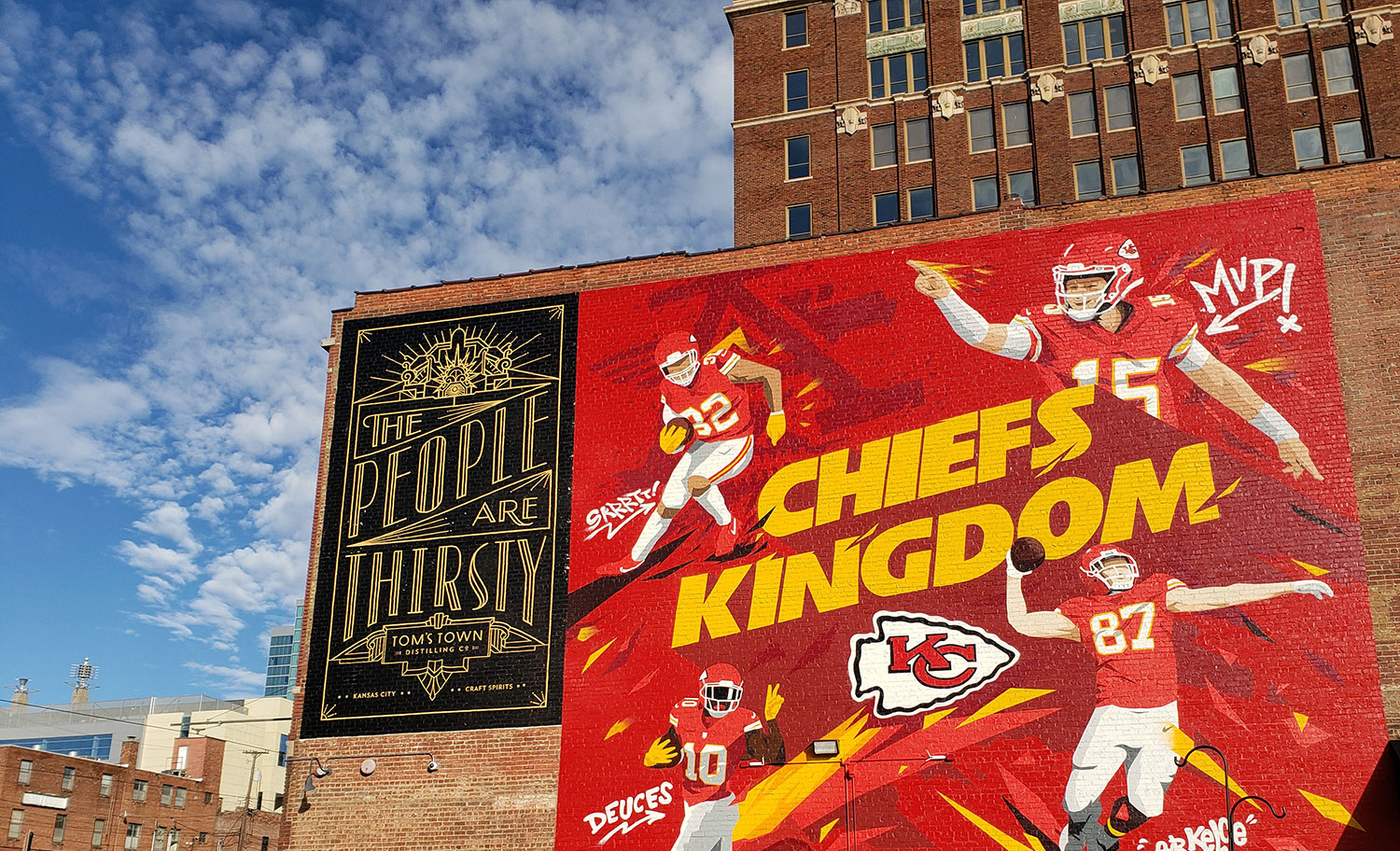
Kansas City Chiefs' Official Gin
Two Iconic Kansas City brands, celebrated with one game-changing gin.
This is Tom’s Town’s new commemorative, limited-edition collaboration
with the Kansas City Chiefs.
Project Tags
Client
- Tom's Town Distilling Co.
Agency
- KCS + Satellite
Credits
- Brand Strategy: Erik Attkisson
- Creative Direction: Kevin Cantrell


